Tag: Color
Color of the Year 2022
Thursday, November 4, 2021 at 6:06pm
 The big trend with the colors of 2022 is GREEN, and paint vendors are revising it in a very soft and lovely way. The color shift that happened in 2021 was MASSIVE! If 2021 was at a ten in terms of levels of change, 2022 is more of a 4-5. It’s not an abrupt shift in colors, but 2022 pushes this beautiful green to the forefront. And it doesn’t come as a surprise, as I’m sure this focus is a result of us being indoors for too long and wanting to recreate a sense of nature within our homes.
Let’s take a look at the stars of the show…
Benjamin Moore:
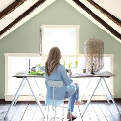
October Mist
We love it! ❤️ It’s a beautiful reprise of sage without the blue-grey undertone, and it has a lovely softness to it. You will have fewer problems with this green like so many others. It’s definitely an expansion in the tint and shade of the 2021 palette.


The 2022 color palettes are similar to 2021 in direction, but there are notes that make some of the colors a bit fresher while some are more subtle. They are playing with tints and shades, but the overall direction is the same with warmer tones. You have a lovely terra cotta, gorgeous wildflower, yummy warm grey, and two whites (including one with a more greenish note.)
Sherwin Williams:
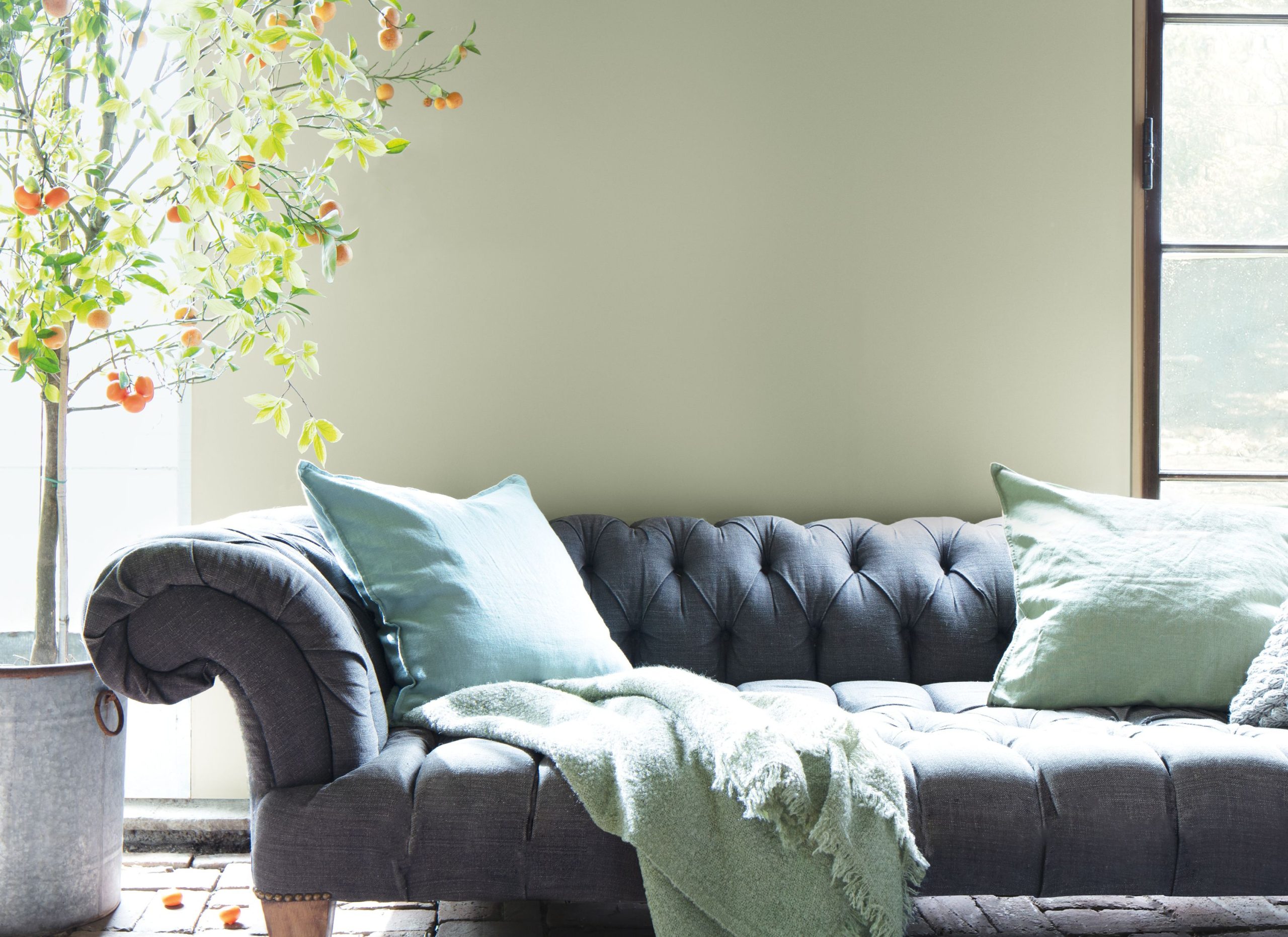
Evergreen Fog
Feels a little more like the original sage but still a very nice green. It’s a versatile and calming hue, a chameleon color of gorgeous green-meets-gray with just a bit of blue. It’s a simple but sophisticated wash of beautiful, organic color for spaces that crave a subtle yet stunning statement shade.
PPG:
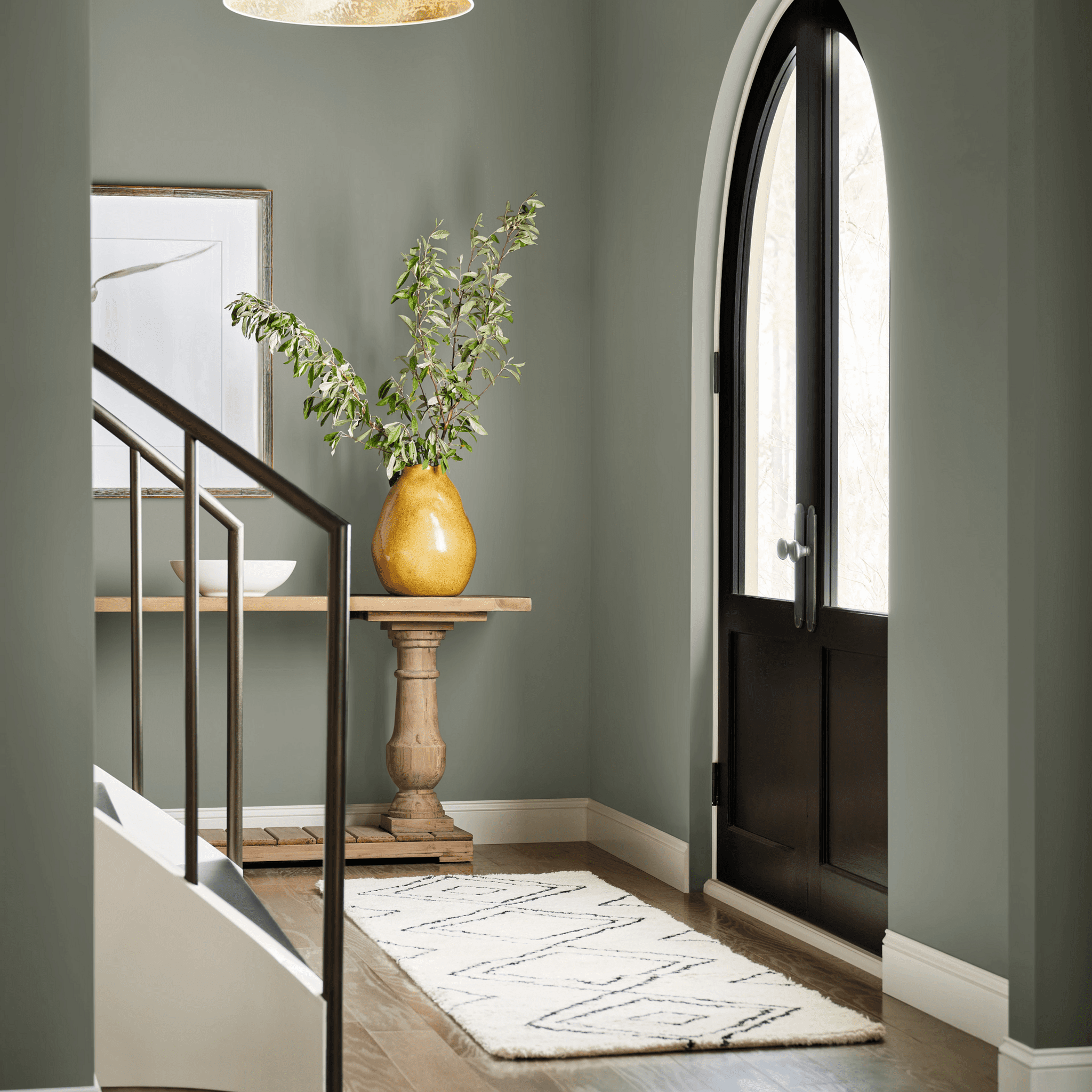
Olive Sprig
This is an elegant, grounded, versatile, and highly-adaptable grey-green. This color represents regrowth in a post-pandemic world and mimics nature’s resiliency. It’s a relaxed but enticing green that emulates the feeling of soothing aloe vera or a fragrant plant – brightening any space with organic liveliness. A versatile color that lives well inside or outside, Olive Sprig blends in with nearly any environment.
Farrow and Ball:

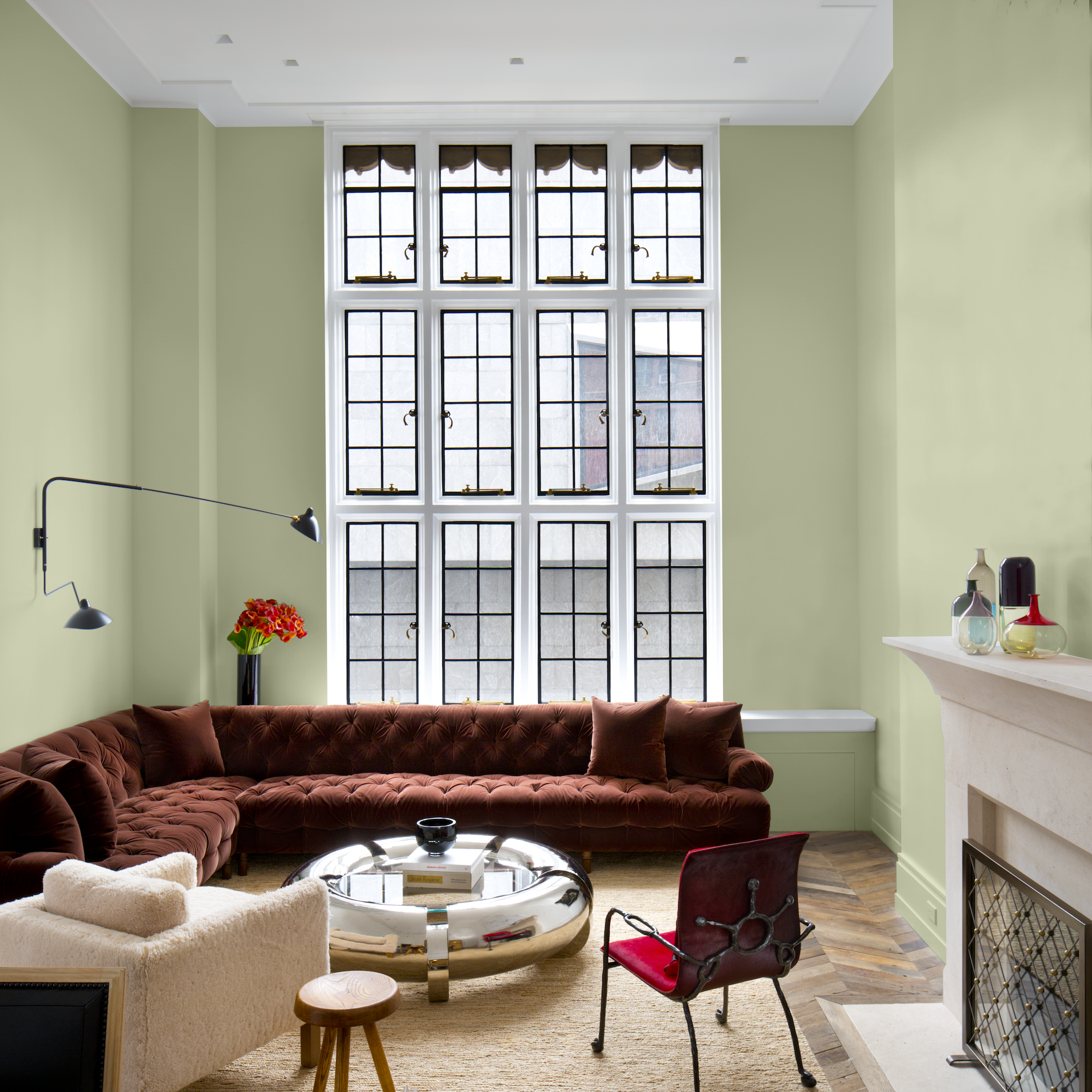
Breakfast Room Green No.81
- The most cheerful of all F&B’s greens
- Remains lively in both bright sunlight and softer candlelight
How Green Affects Us

Green has an emotionally calming effect. It reminds us of nature, which creates a very grounding experience.
Here’s the thing to remember about green: it is not skin-friendly, meaning that green rooms make people look less robust and healthy.
Green is a tricky one, so you have to be careful where you put it in your home. For example, green bathrooms are a BIG mistake as they make your skin tone look sallow and unhealthy.
Like every other paint color, make sure that BEFORE you choose colors for a palette, you should check out the Stop Painting Now video or our ebook How to Pick Paint Colors, which highlights the fail-proof secret rule of three!
Ooh! If a DIY paint project is in your future, then you absolutely MUST read Painting 101!
You can check both of those ebooks out in The Library! 🙂
Oh yeah! Have you taken the Color IQ Quiz yet? No? We think you’re gonna love it! 💚 💚 💚